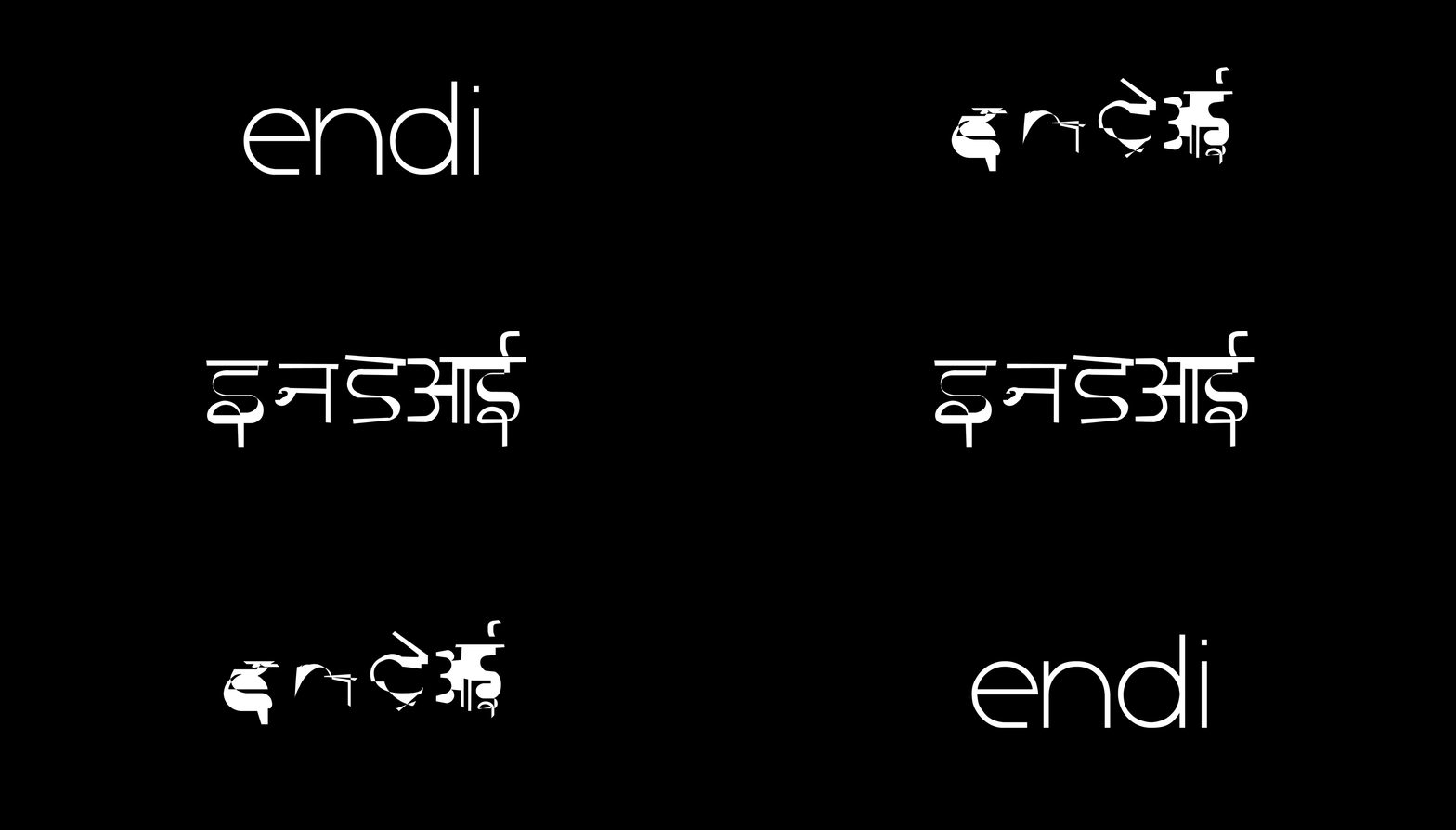
Endi
Type Design
In-between: MA Thesis Project
Royal College of Art, London
2021
As a polyglot, I often contemplate about the hybridity of language. I believe that spoken language continually evolves with time and culture. For example, non-creole hybrids such as Hinglish (amalgamation of hindi+english), Arabish (amalgamation of hindi+arabic) and Konglish (use of english words in the Korean context) are few amongst many ways in which languages have abstracted themselves.
As a graphic designer, I imagined a solution through type. Typography facilitates language and its communication. It translates language into legible forms. It represents different languages through multiple scripts. It is a tool, a system.
As a graphic designer, I imagined a solution through type. Typography facilitates language and its communication. It translates language into legible forms. It represents different languages through multiple scripts. It is a tool, a system.
What if a typeface could visualise and acknowledge this hybridity and abstraction of language? Can typography be used as a tool for to speculate translation?
To know more about this project, visit https://in-between.xyz/Language.
To know more about this project, visit https://in-between.xyz/Language.
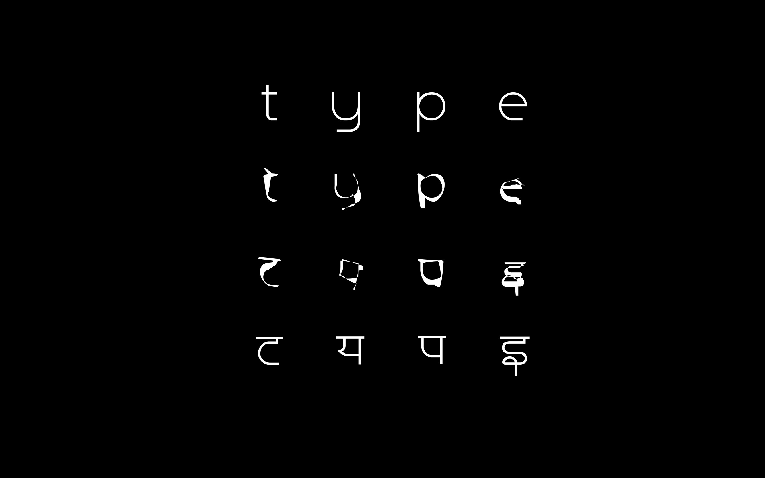
On Language and Typography
Endi is a variable typeface exploring the notion of translation between languages through form. It varies from Latin to Devanagari, which represent different font weights.
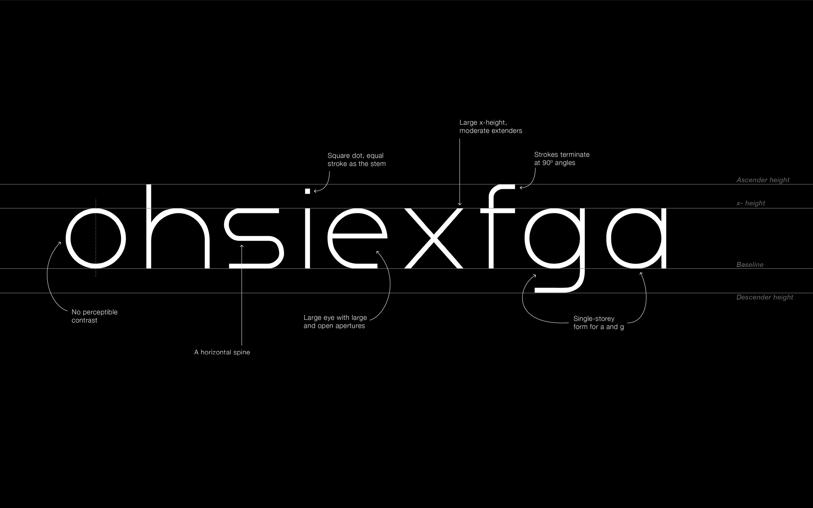 Anatomy of the Latin forms
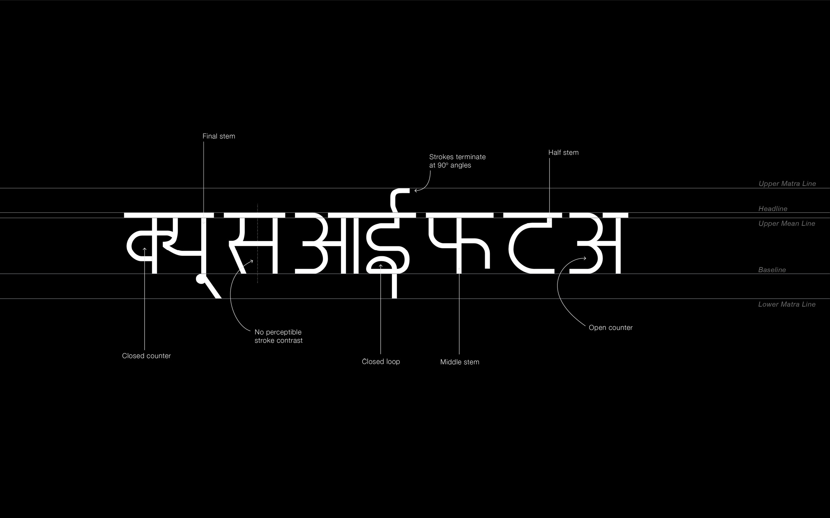 Anatomy of the Devanagari forms
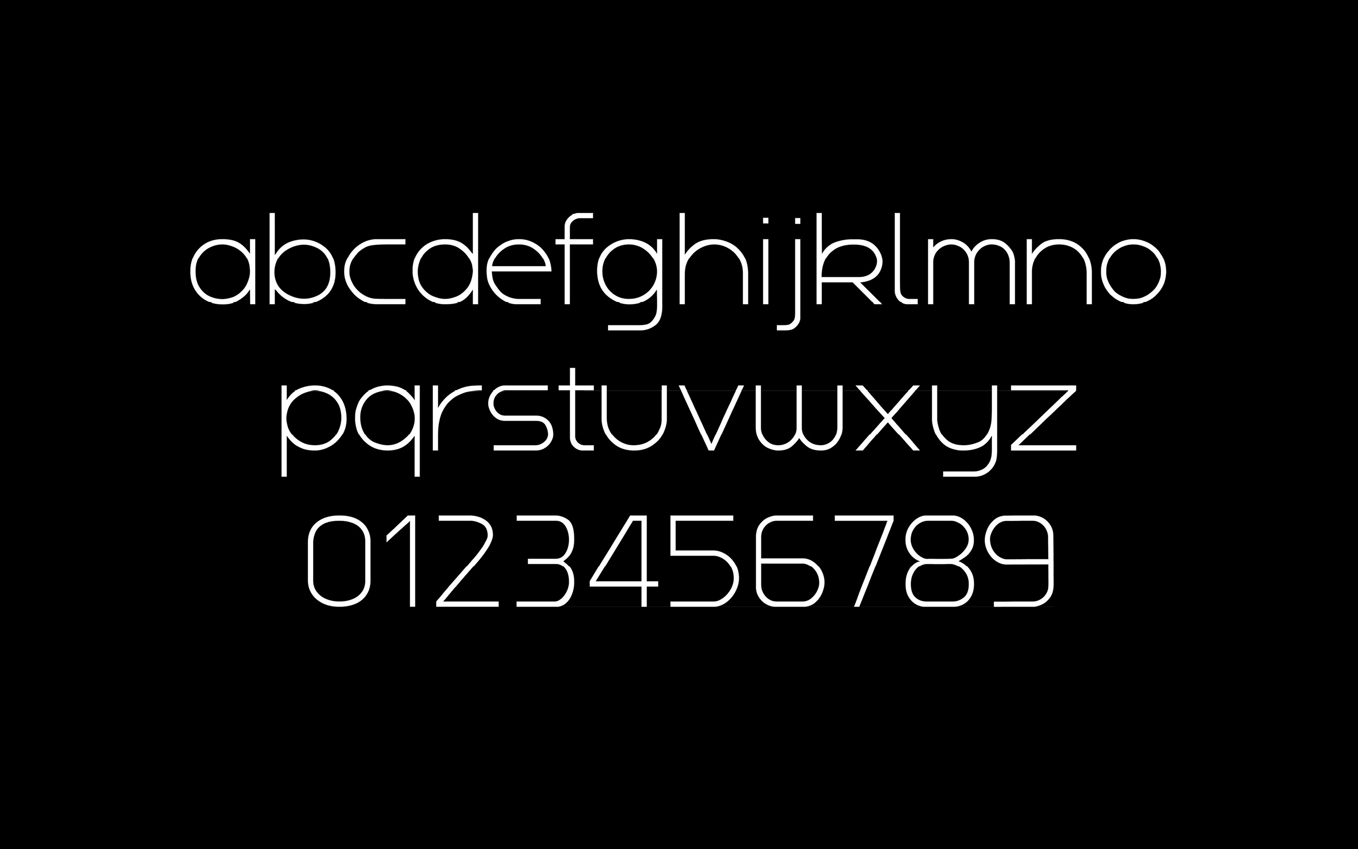 Endi Latin
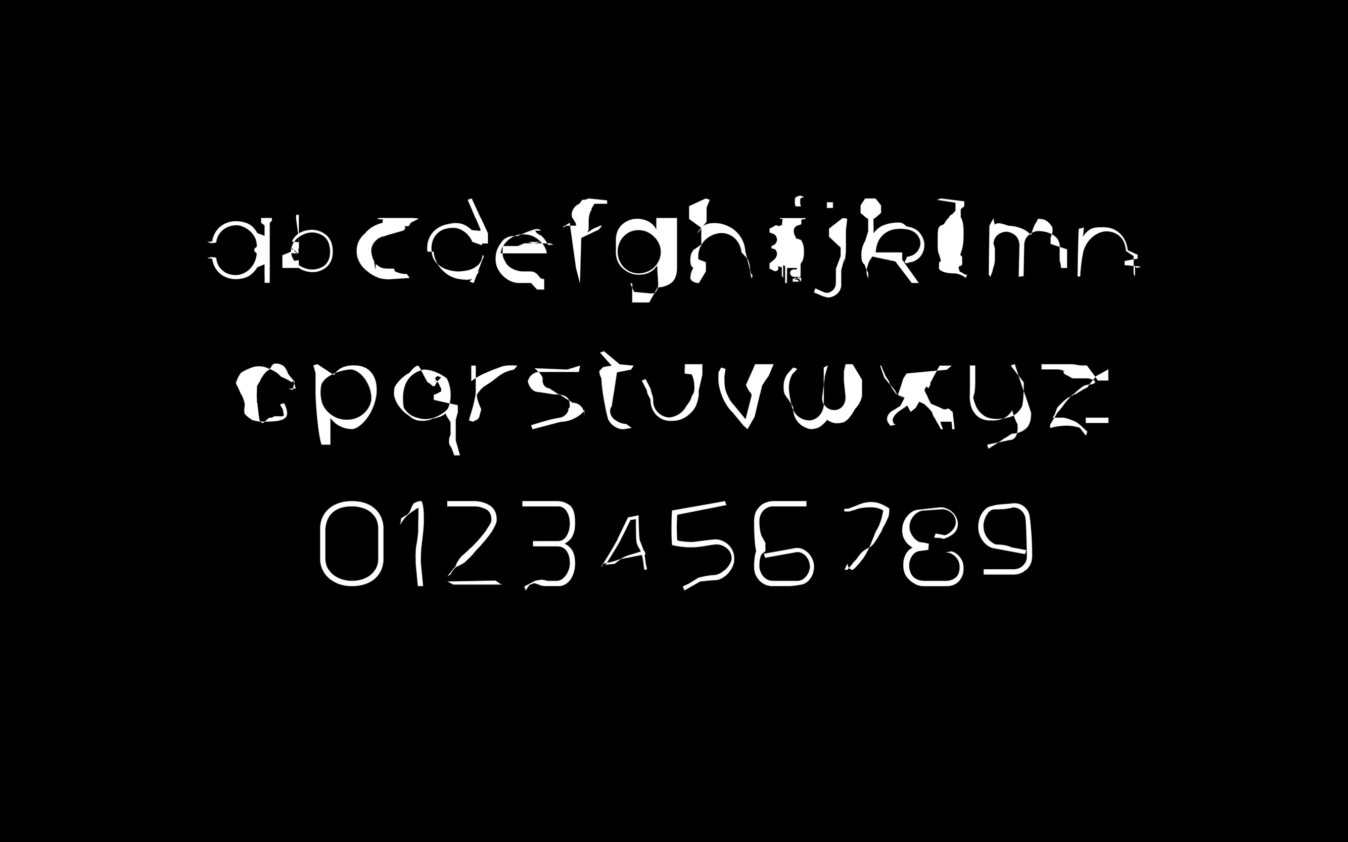 Endi (Inbetween Latin and Devanagari) - Instance I
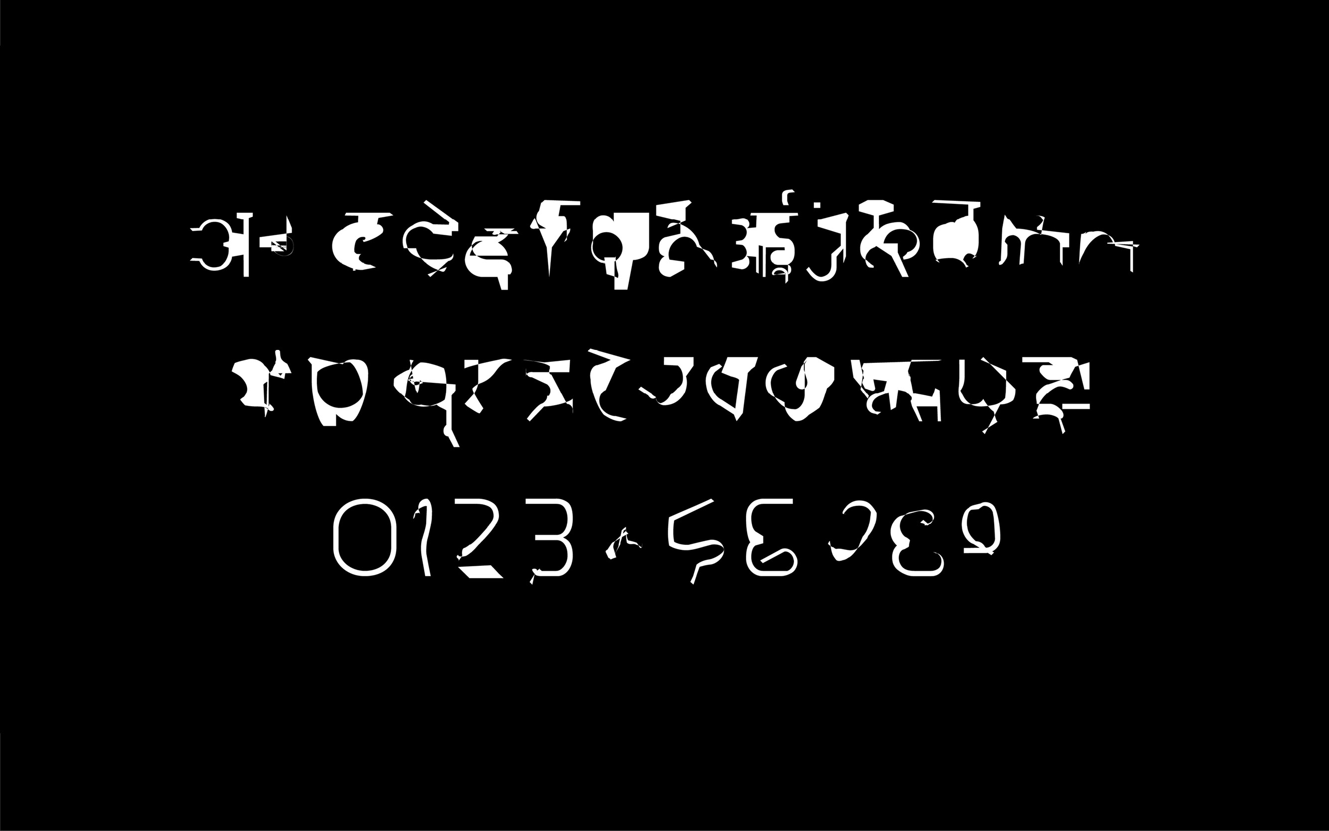 Endi (Inbetween Latin and Devanagari) - Instance II
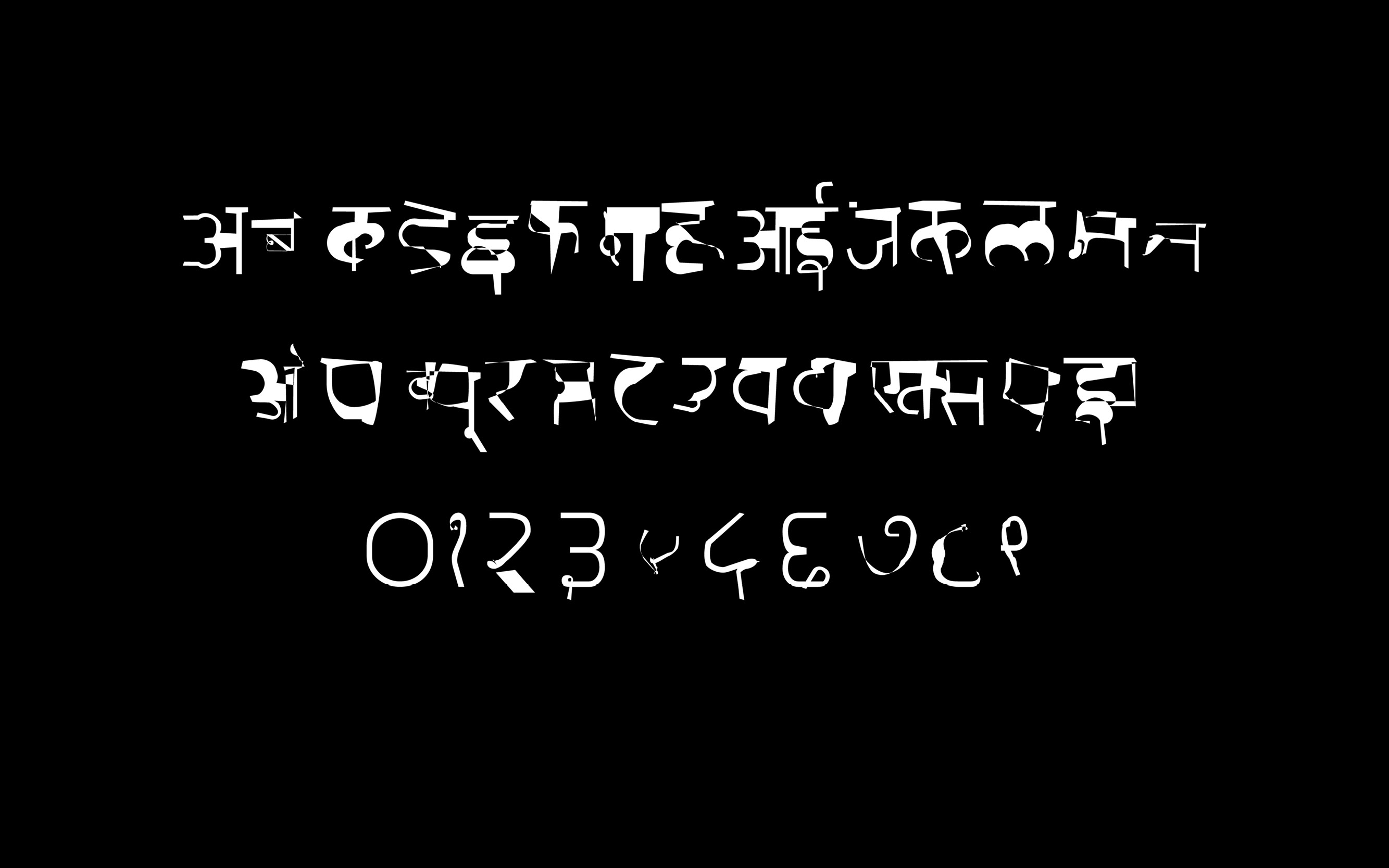 Endi ( Inbetween Latin and Devanagari) - Instance III
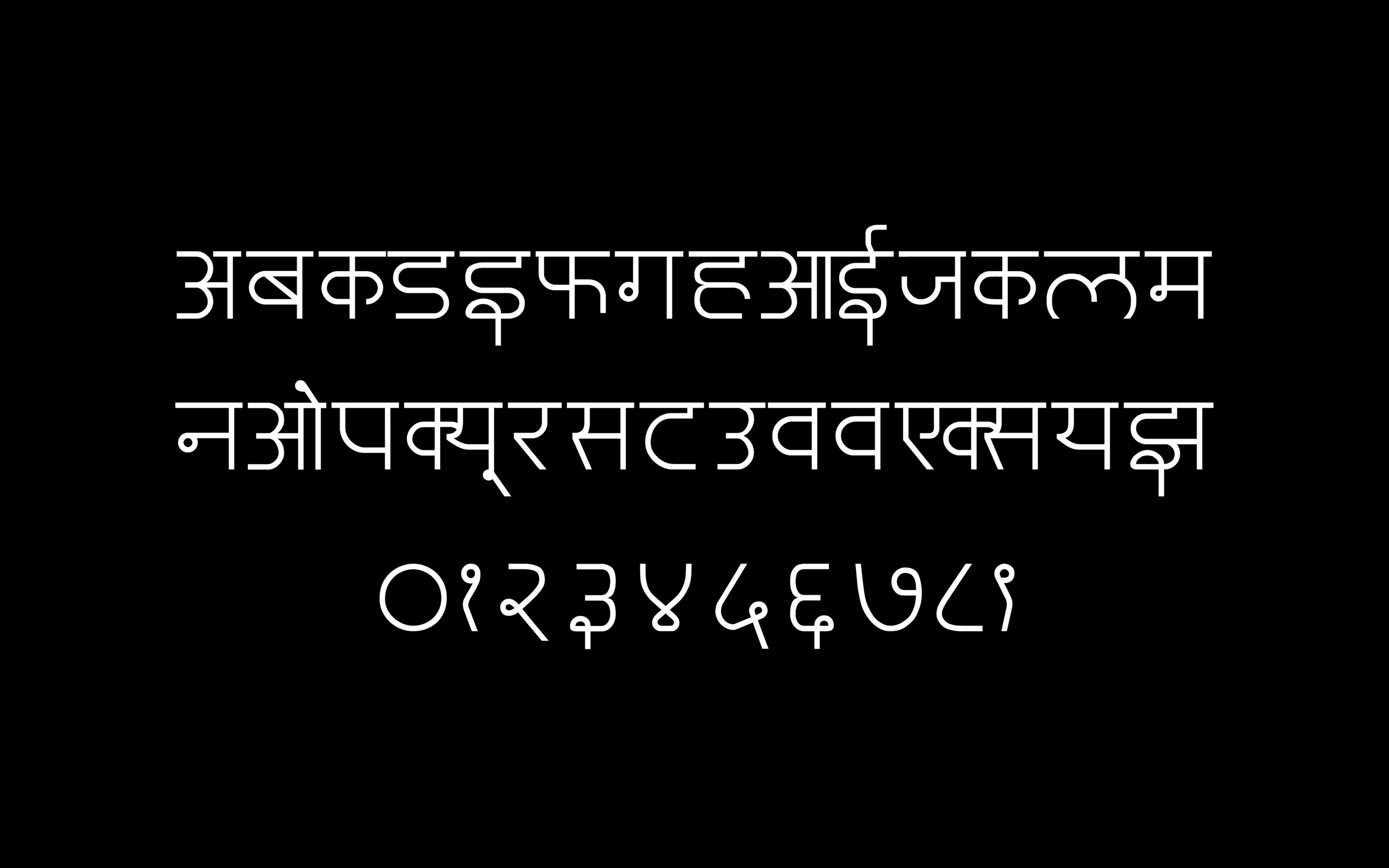 Endi Devanagari
Research
I began my research with two languages which I am fluent in, English and Hindi. I interrogated these languages and its scripts through the devices we use. While smartphones and touch devices offer a range of keyboards with instantaneous response, laptops and desktop devices significantly differ.
While on a ‘English keyboard’ laptop one can activate a keyboard for another language but the basis for the translation is complicated. For example, if one were to type out the word ‘hello’, while using the Hindi keyboard, it’s Devanagari equivalent in hindi, would sound like ‘pattd’. Hence, bearing no phonetic resemblance to its Latin counterpart.
This complicated nature for translation with keyboards, individually clicking through each glyph makes the process of writing in another language using these devices rather tedious.
As a result, I decided to create a typeface which could probably aid this translation or speculate it. I wanted to create a variable typeface which could translate between from its Latin characters to its Devanagari counterpart. To understand more about the nuances of translation I decided to reach other bilinguals (speaking Hindi and English) through a survey.
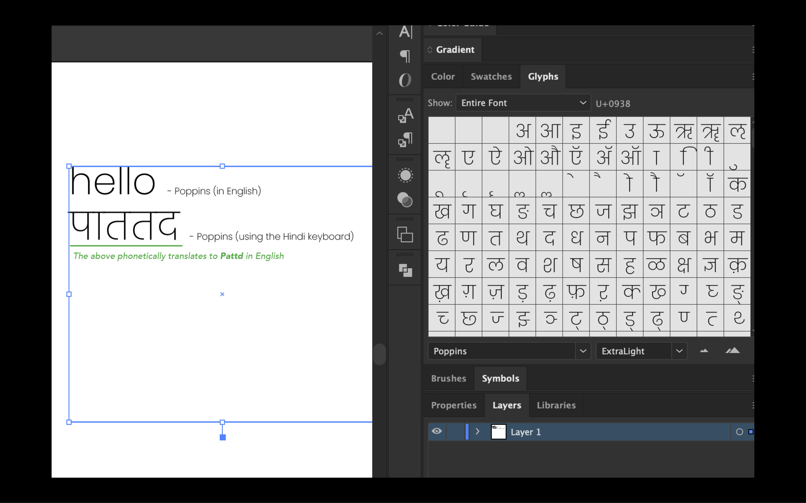 Devanagari vs Latin
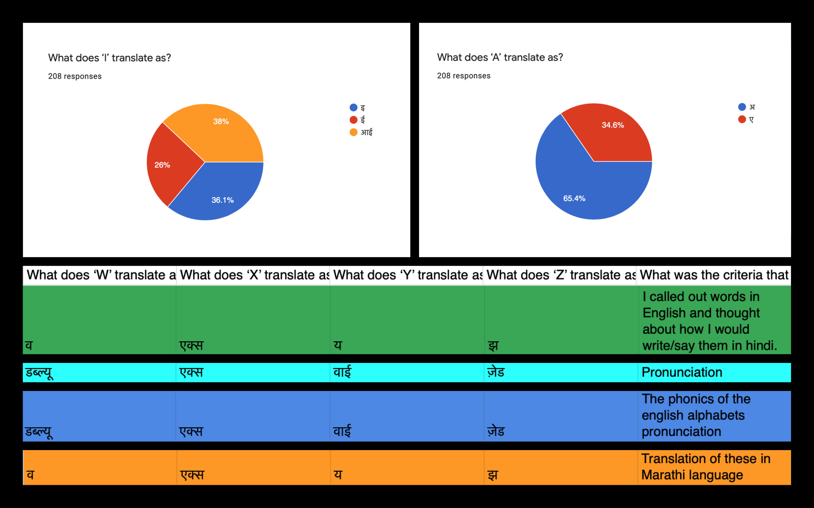 The Survey
This survey was integral to my research as it helped me to understand my audience and how they translate between the two languages.
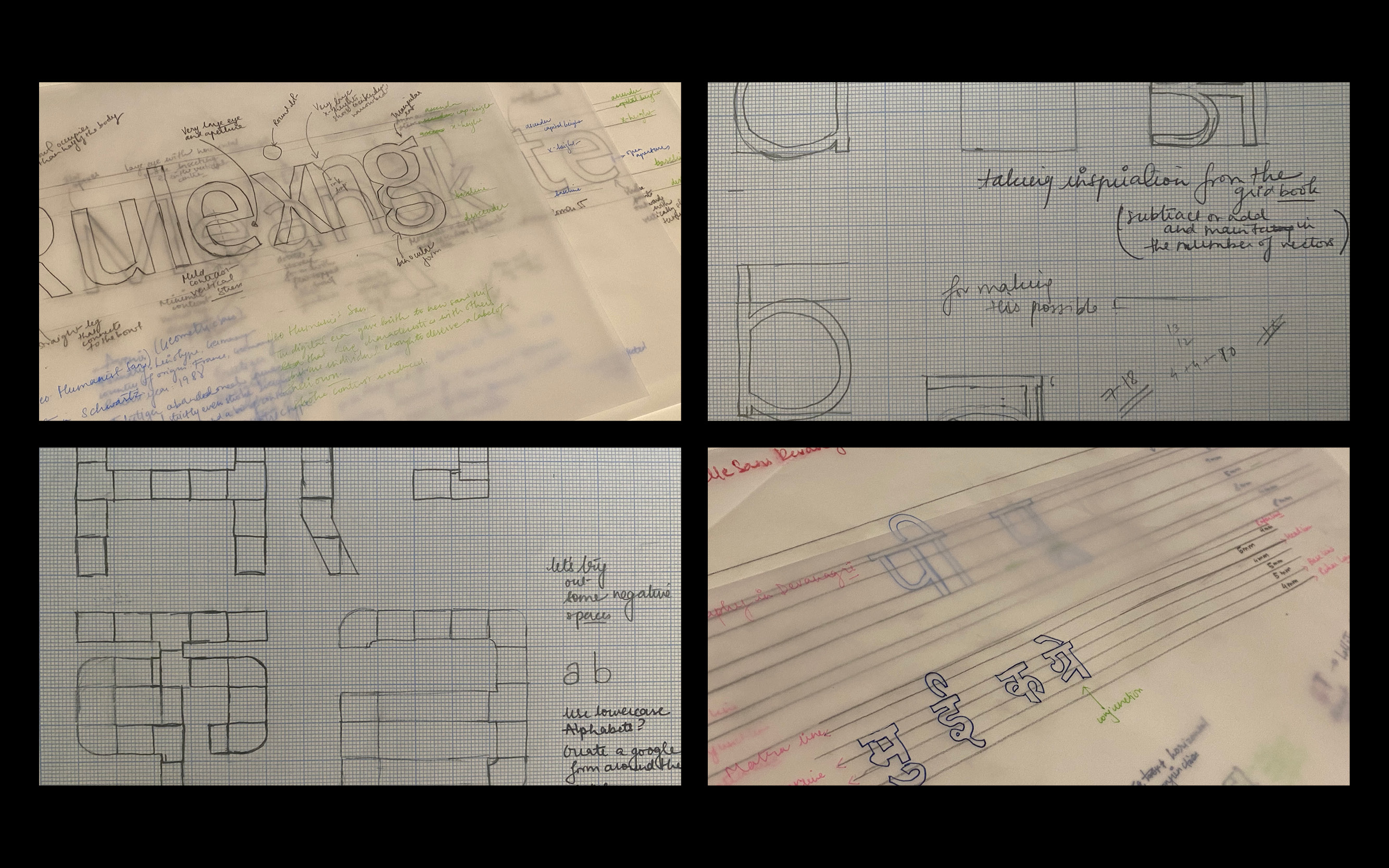 The process began with drawing and studying different typefaces to learn about legibility, forms and proportions.
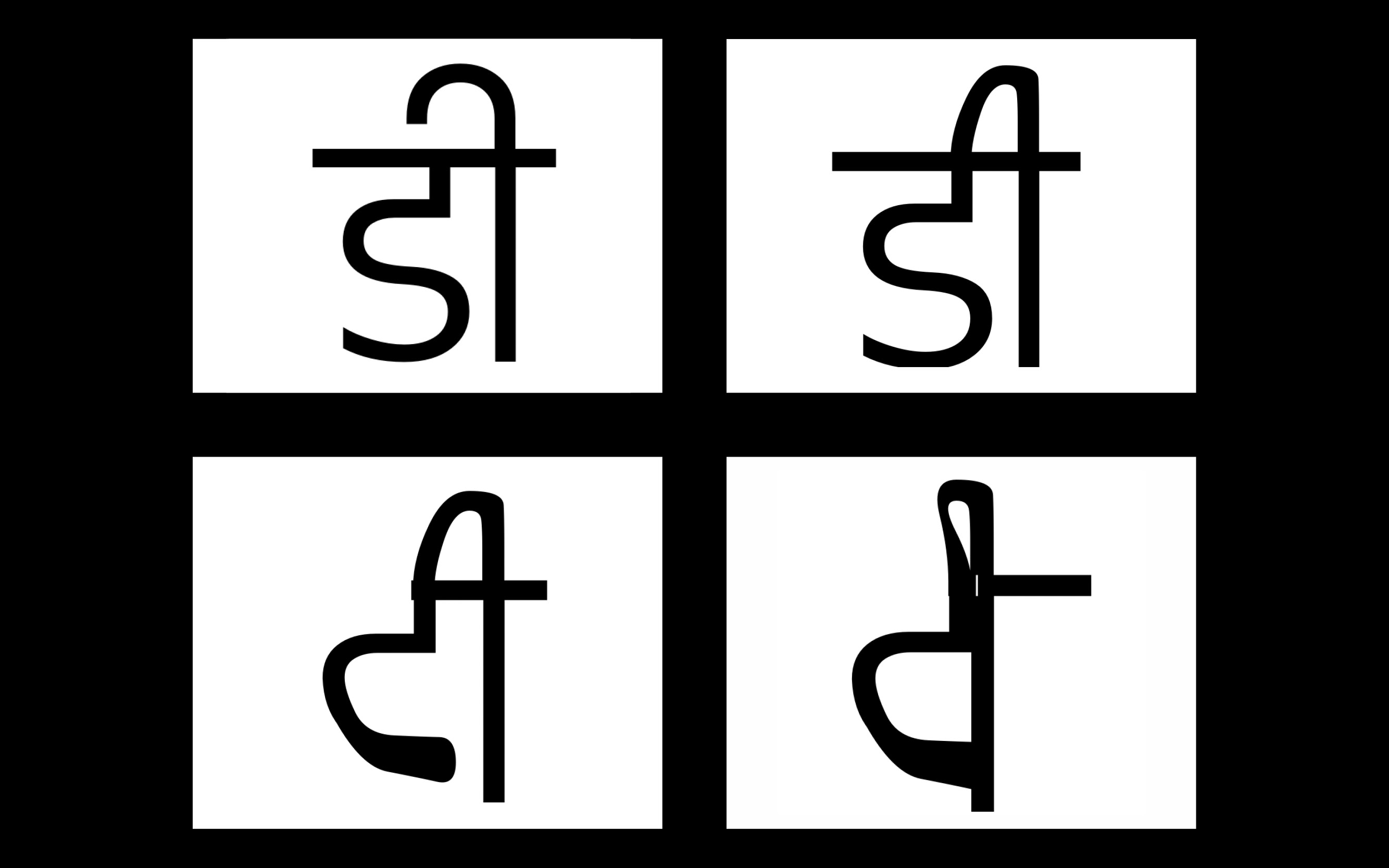 Variable Type Iteration 1
 Learning about Glyphs, vector chronology and count for designing a variable typeface.
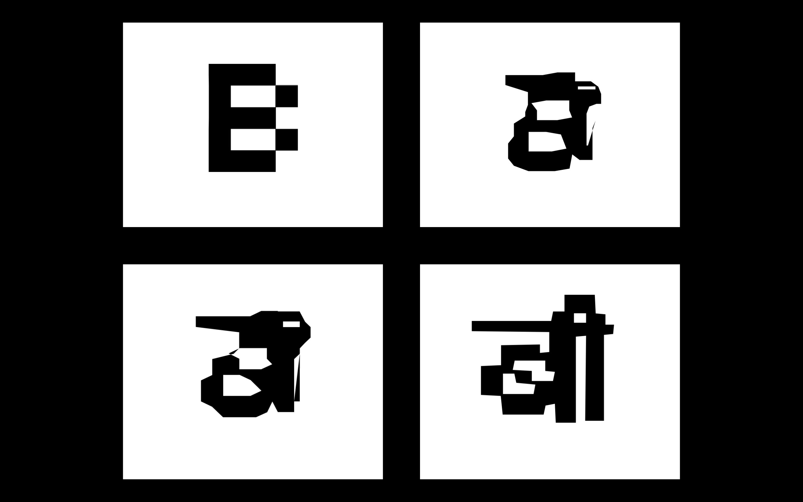 Variable Type Iteration 2
Experimenting with legibility and forms for the typeface.
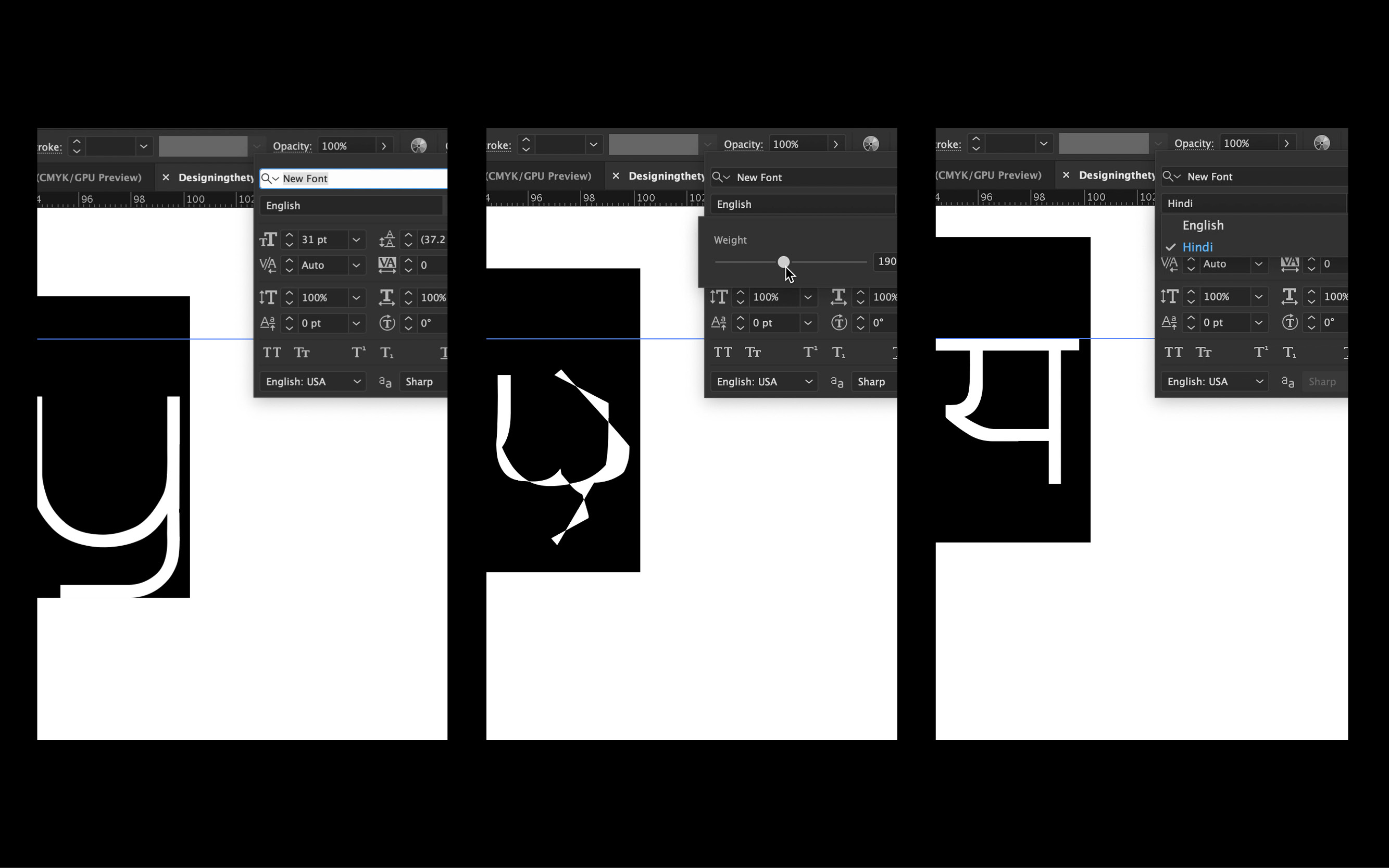 Endi in use (on Adobe Illustrator)
The function of this typeface is to explore, experiment, discover the in-betweens of two languages and forms.
Workshop
Endi was designed over the lockdown at the mercy of digital tools and their limitations. The process of translation is non-linear, hence I decided to take an alternative approach for documenting this transition. The participants in this workshop imagined the metamorphosis between the two extreme forms providing a new vocabulary for this visual translation.
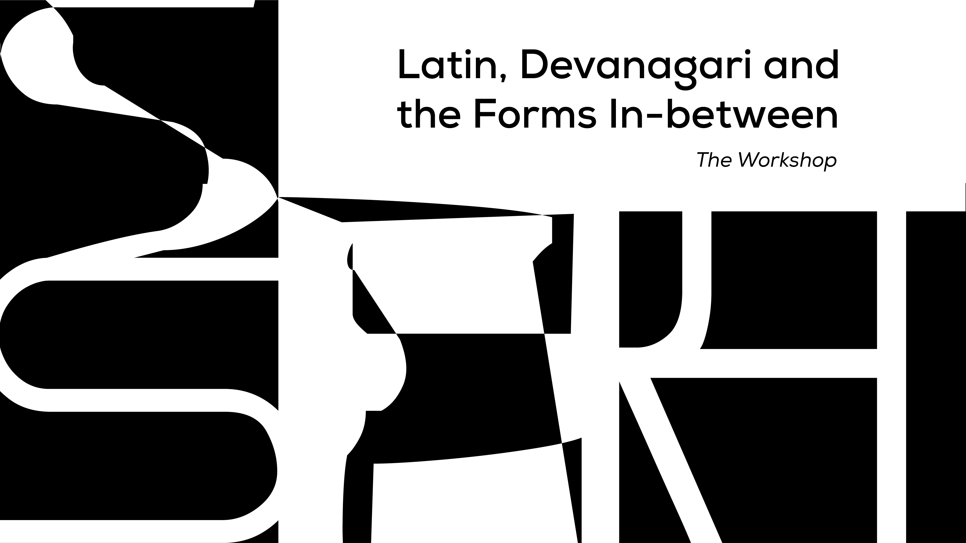
Latin, Devanagari and the Forms In-between: The Workshop
Click on the image to learn more about the workshop.